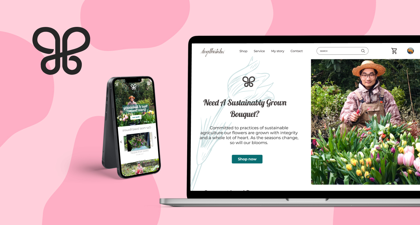
Hungblomster E-commerce
Responsive Website For A Local Business
Overview
Hungblomster is a website to order organic flowers online. The typical users are people care about organic products in Denmark and the people want to send flowers to their family and friends in Denmark.
| Roles | Tools | Project Duration |
|---|---|---|
| UX Research/Designer, UI Designer | Figma | Sept 2021 - Oct 2021 |
The Problem
Everything we do makes an impact. LOOK FOR SAFE & ETHICAL FARMING PRACTICES. You would support your local farmer when buying organic produce. Conventionally grown flowers are treated much in the same way as non-organic fruits and vegetables—and the negative consequences of toxic chemicals reaches far and wide.
The Goal
Design a friendly to users to order Organic flowers without coming to the market or the shop.
Responsibilities
Conducting interviews, paper and digital wireframing, low and high-fidelity prototyping, conducting usability studies, accounting for accessibility, iterating on designs, determining information architecture, and responsive design.
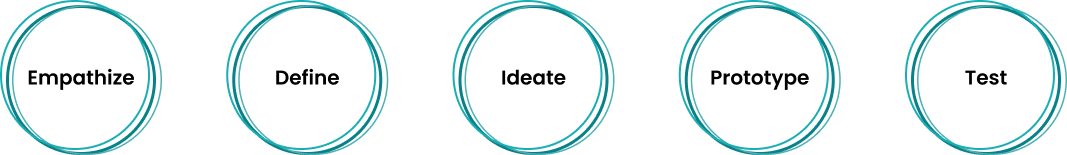
Design Process
1. EMPATHIZE
I conducted user interviews, which I then turned into empathy maps to better understand their needs. I discovered that many target users care about organic flowers. However, they can not find a typical flower shop like that, and they can not find the option to delivery flowers.
User pain points
- Experience No website to order organic flowers
- Navigation Be overwhelm to the interaction from the big flowers website.
- Interaction Shipping fee from international website is expensive
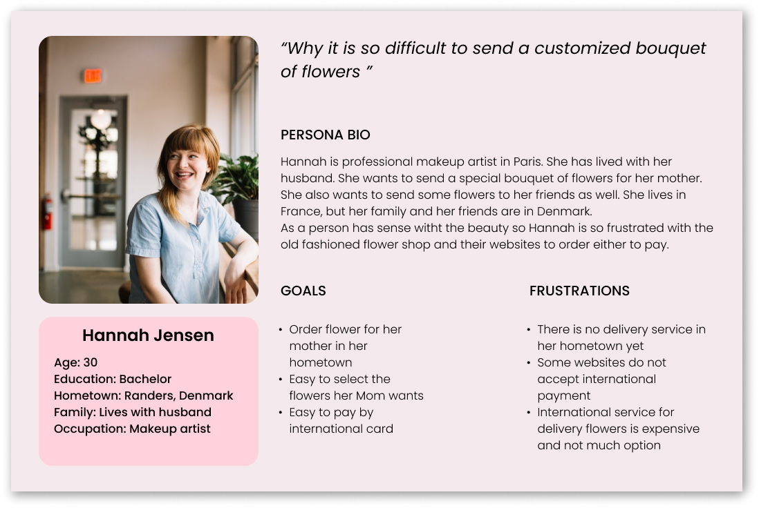
Personas & problem statements
Hannah is professional makeup artist in Paris. She wants to send a special bouquet of flowers for her mother. Hannah is so frustrated with the old fashioned flower shop and their websites to order either to pay.
2. DEFINE
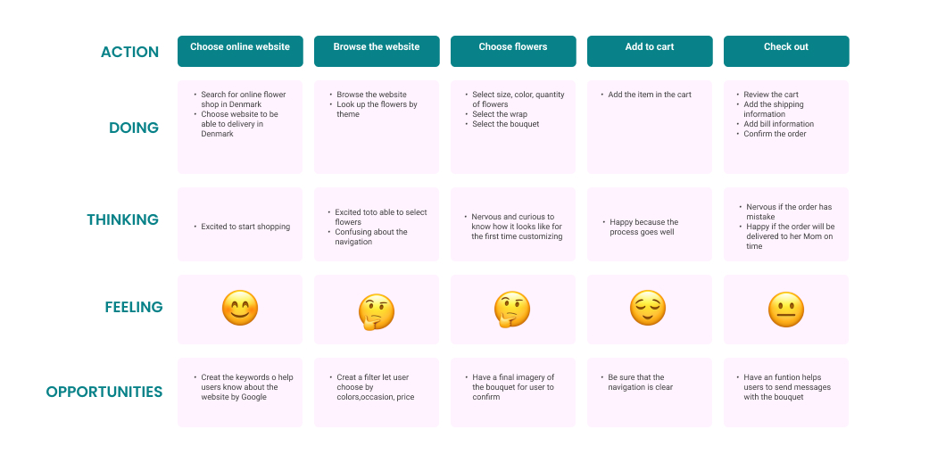
User journey map
I created a user journey map of Hannah’s experience using the site to help identify possible pain points and improvement opportunities.
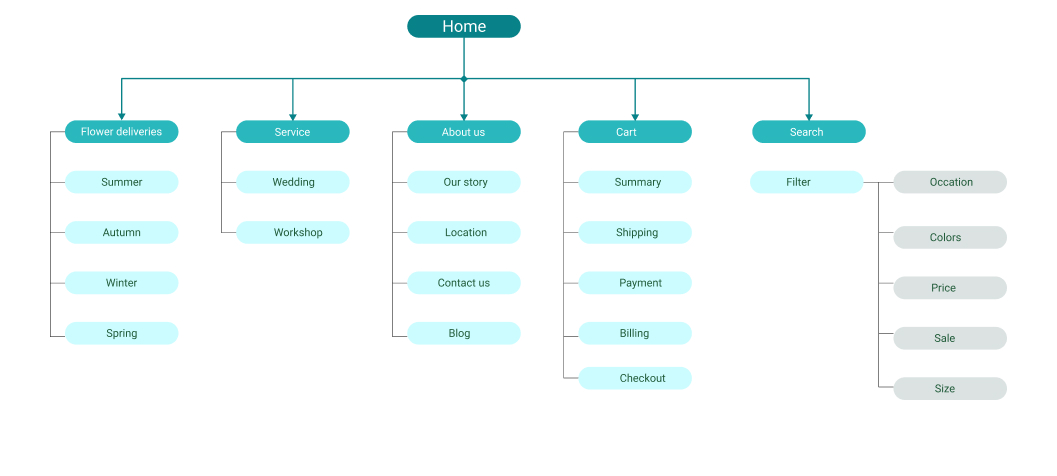
Information Architecture
I want to create a simple and effective for the users to order delivery organic flowers. I focus on how I can navigate the users easy and minimal. Using the insights as well as our user needs defined earlier, I created a sitemap for ideating the site.
3. IDEATE
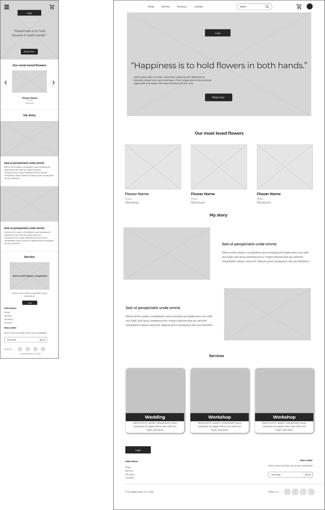
Paper wireframe screen size variations
I started to work on designs for additional screen sizes to make sure the site would be fully responsive. In this wireframe I designed more options to user be able to shop easier. Otherwise I also showed user the most wanted products
4. PROTOTYPE
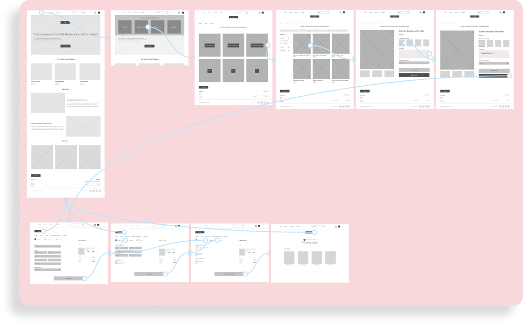
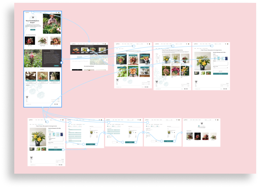
Low-fidelity prototype
The low-fi prototype is the primary user flow of adding an item to the cart and checking out.
Check out the Hungblomster
Usability study: findings
To start testing the designs, I created a low-fidelity prototype for testing.This prototype was used in an unmoderated usability study with 5 participants. Here are the main findings uncovered by the usability study
- Checkout Once at the checkout screen, users didn’t see an easy way to go back the previous page
- Button Users were not able to click on the favorite flowers.
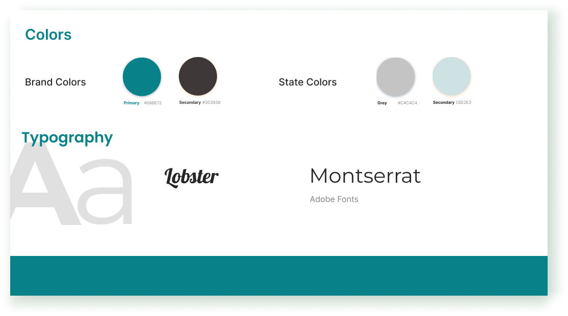
Style guide
The color palette is minimal color palette which similarly featured a light dark green, black, and grey.
Refining the design
I made changes to improve the site’s checkout flow. One of the changes I made was adding button “back” and “cancel” if users need to change their mind. This allowed users more freedom to edit their choice without clicking on home button.
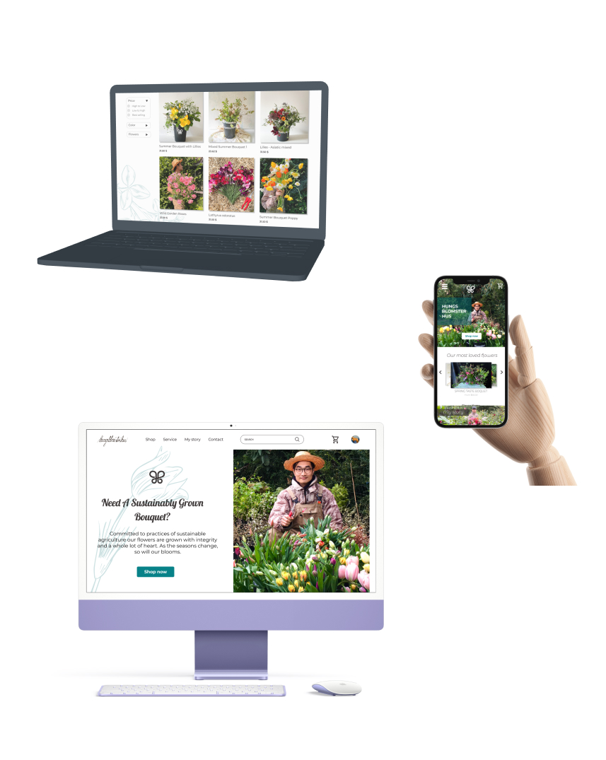
High-fidelity prototype
My hi-fi prototype followed the same user flow as the lo-fi prototype, and included the design changes made after the usability study.
5. TEST
Accessibility considerations
- I used headings with different sized text for clear visual hierarchy
- I used breadcrums to help users navigate the site.
- I consider using the color for accessibility
Takeaways
Impact
- Organic products community shared that they are so surprised and happy to find an organic flower store.
What I learned
- I have learned that by changing a small detail in the design can change the user experience and perspective.
- The most important thing is focusing in user needs.
- Work with what you have. You can make a sketch with a paper and a pencil to creat a story board.
- Don’t underestimate the power of wireframing and testing those wireframes. I know personally, as a new designer, I get excited and want to go straight to the colors and the fun stuff but we caught a lot of things in the low fidelity prototype that would’ve been much more difficult to fix later on.
Next steps
- Conduct more usability test when I want to add more functions in the website.
- I want to continue to work on user research skills to improve my ability to tell a story in the designs I create and foster effective experiences in my products.
- Find and detect the users pain point in using the website.