Yin Yoga Timer
Specific Yin Yoga App
Overview
We are creating a Yin yoga timer app to help yogis can customize their own flow and set their timer while practicing Yin Yoga or meditation. We noticed that our competitors are doing very good in their yoga apps. But they do not care so much in Yin and setup timer for Yogis want to create the flown by picking up the poses.
| Roles | Tools | Project Duration |
|---|---|---|
| UX Research/Designer, UI Designer | Figma | Apr 2021 - Jun 2021 |
The Problem
While “yang” yoga focuses on your muscles, yin yoga targets your deep connective tissues, like your fascia, ligaments, joints, and bones. It’s slower and more meditative, giving you space to turn inward and tune into both your mind and the physical sensations of your body. Yin yoga poses are held for about 3-5 minutes so Yogi can not customize their own Yin Yoga flow with setting timer at the same time.
The Goal
Design an app for Yin Timer that allows users easily to customize, and set up their own flow, timer.
Responsibilities
Conducting paper and digital wireframes, low and high-fidelity prototyping, conducting usability studies, accounting for accessibility, and iterating on designs.
Design Process

1. EMPATHIZE
I researched and created empathy maps to understand the users I’m designing for users needs. A primary user group identified through research was Yogis who want to create their own sequence without interrupting from setting timer for each postures. Yin Yoga is a slow-paced style of yoga as exercise, each of postures will last 3- 5 mins. Yin Timer’s users are intermediate yogis who want something more than a video to follow.
User pain points
- Time Working a 5-9 job users in the big city are so busy to schedule for a Yoga class in the studio
- Platform No friendly platform for Yin yogis
- Information artchitect It’s not easy to set up multiple timer, expert yogi cant’ customize their own sequence
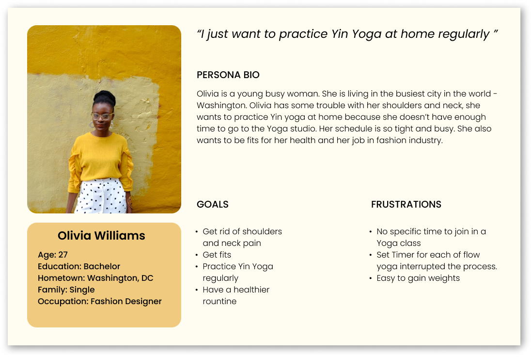
Personas & problem statements
Olivia is a fashion designer living in Washinton, DC. She needs to practice Yin Yoga at least 3 times per week. She wants to get rid of shouders and neck pain.
2. DEFINE
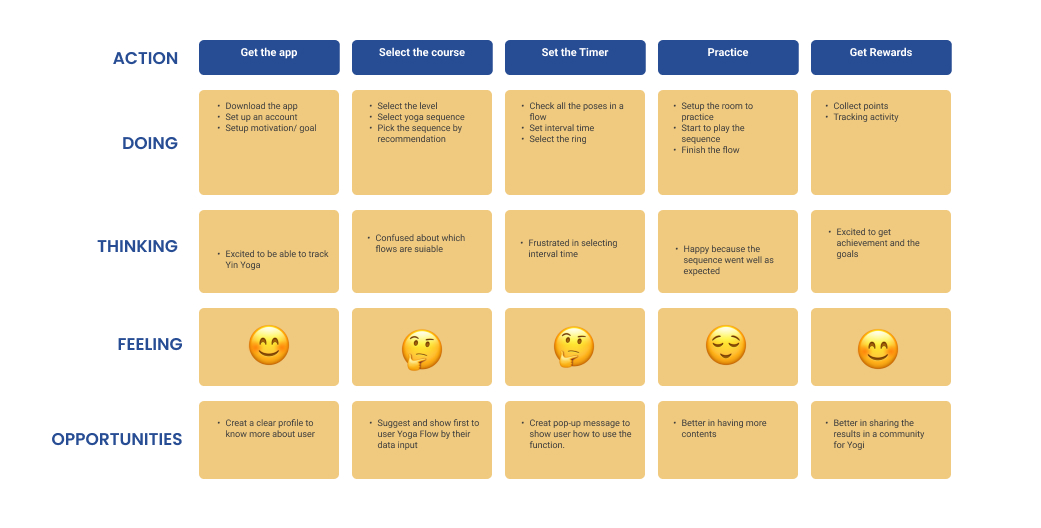
User journey map
Mapping Olivia’s user journey revealed how helpful it would be for users to have access to Yin Timer app.
3. IDEATE
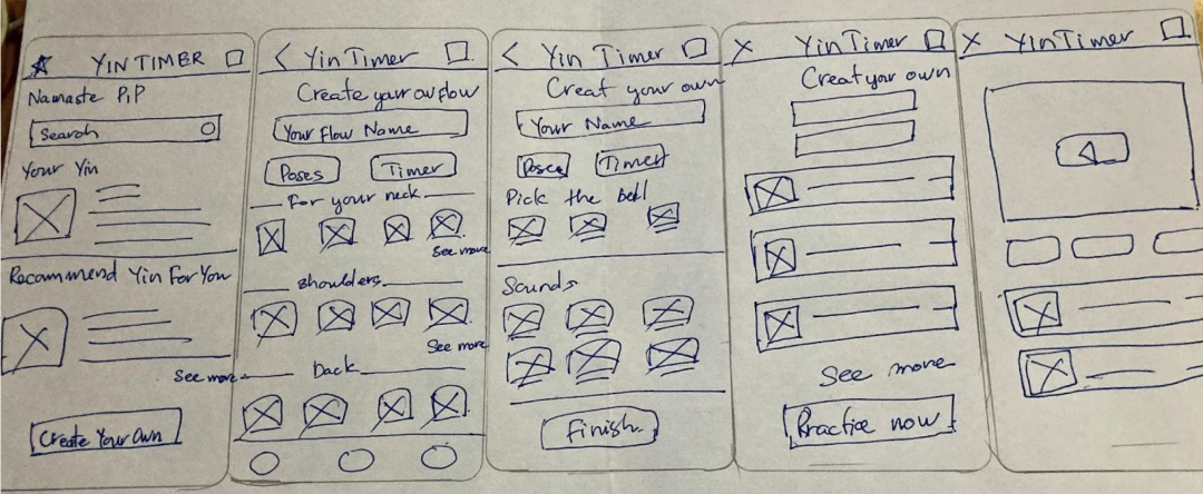
Paper wireframe screen size variations
I created the paper wireframwe to address the user pain point about creating their own sequence and timer at the same time.
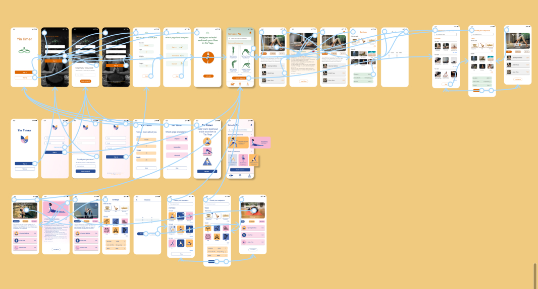
Digital wireframe
Follow the initial phase. I created the digital wireframes from the feedback and the research result.
4. PROTOTYPE
Low-fidelity prototype
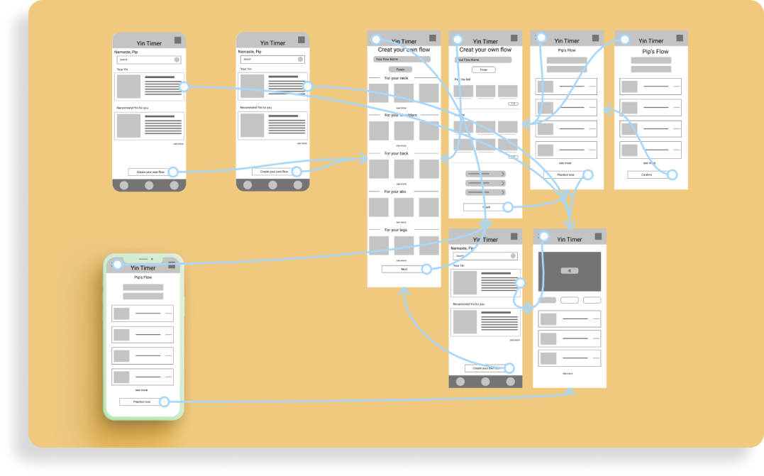
I created low- fidelity prototype that I can use this primary process in usability study. This main process will help users to solve their problem to make their own sequences.
Here is the link for Low-fidelity prototype
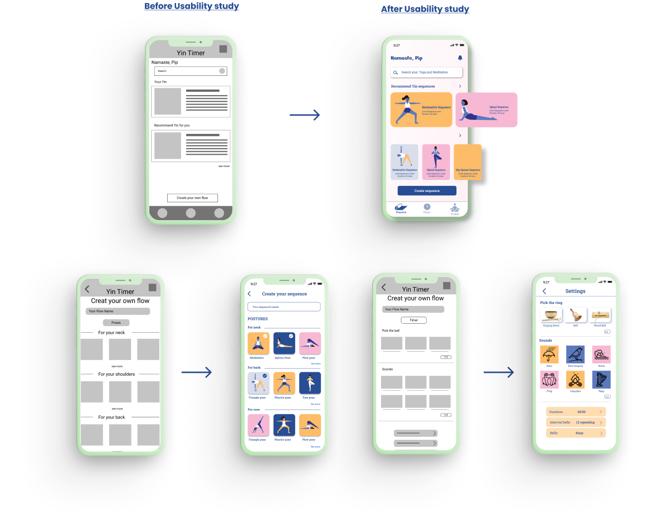
Usability study: findings
I conducted two rounds of usability studies. From the first study helped guide the designs from wireframes to low- fidelity prototype. The second study used a high-fidelity prototype and revealed what aspects of the mockups needed refining.
- Round 1 Users want to customize sequences Users want to pick the timer Users want to practice Yin at home
- Round 2 Pose and Timer are hard to distinguish Uses want to know more information about postures Having more option for users want to boots specific part
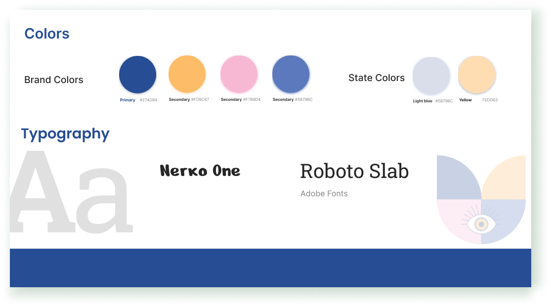
Style guide
I like the balance constract between dark navy blue with light orange and pink.
Refining the design
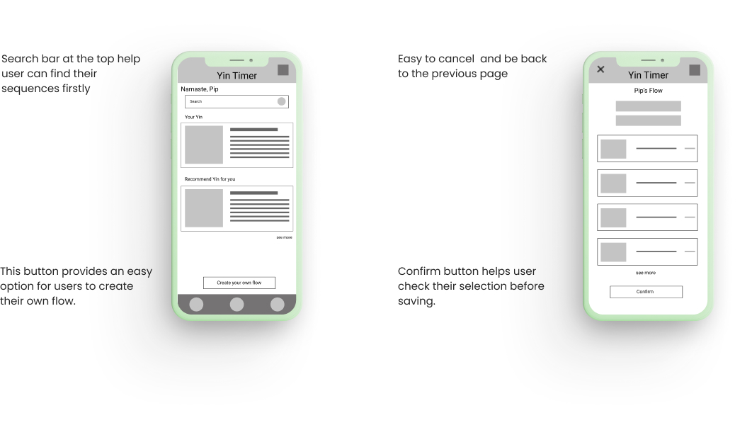
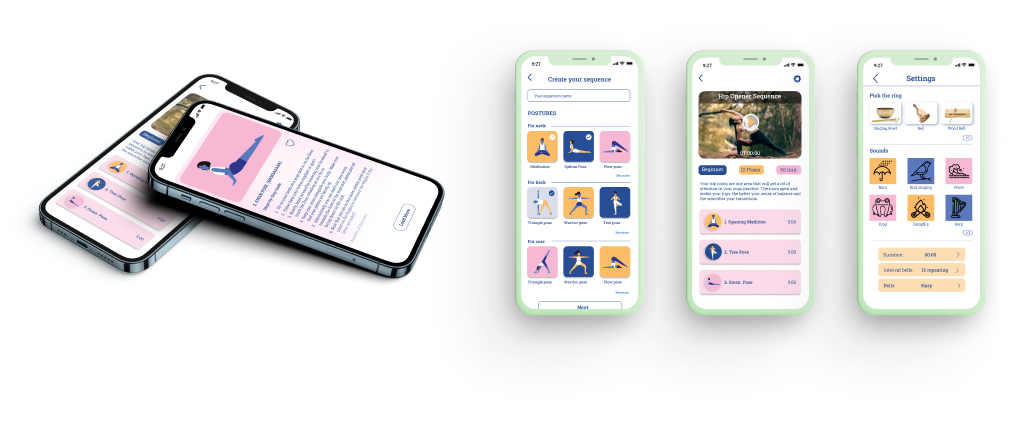
In the digital design I made “creat your own flow” button right on the homepage. After usability study I put more recommendation on the first space for user understand how a flow works. After usability study 2 I saw the frustration with selection pose and timer for user. I created it clean and clear to navigate by buttons “Save” and “Cancel”.
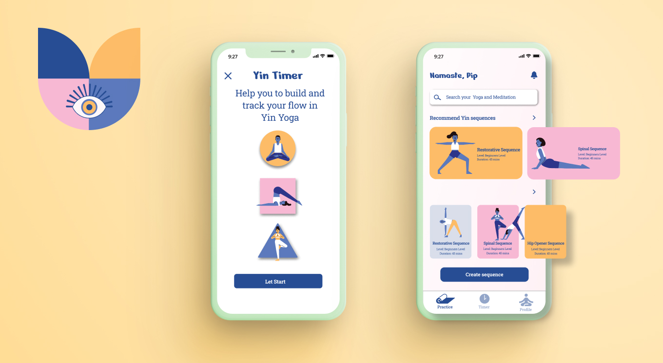
Mockup
High-fidelity prototype
The final high- fidelity prototype showed cleanser user flows to customize their own sequences. Yin Timer prototype
5. TEST
Accessibility considerations
- Used icons to help users navigate easier
- Used clear imagery for postures and detail explanation to help all users better understand the designs.
Takeaways
Impact
- The app helps user practice Yin yoga at home and give user the choice to customize their own sequences. For immediate Yogi they can find out with sequence is the best for them.
- One quote from peer feedback: This app makes my practice at home like in Yoga class. I can focus completely on my flow without looking at the screen. All I need to do is set it up
What I learned
- When I started designing the app by the idea in my mind until I actually did it. I have learned a lot of things. The problems were found out after conducting usability study and user interaction on the app.
Next steps
- Continue conduct another round for usability studies to solve the pain poins user
- Keep conducting more user research to update the new needs
- Keep updating about competitor and new trend in design